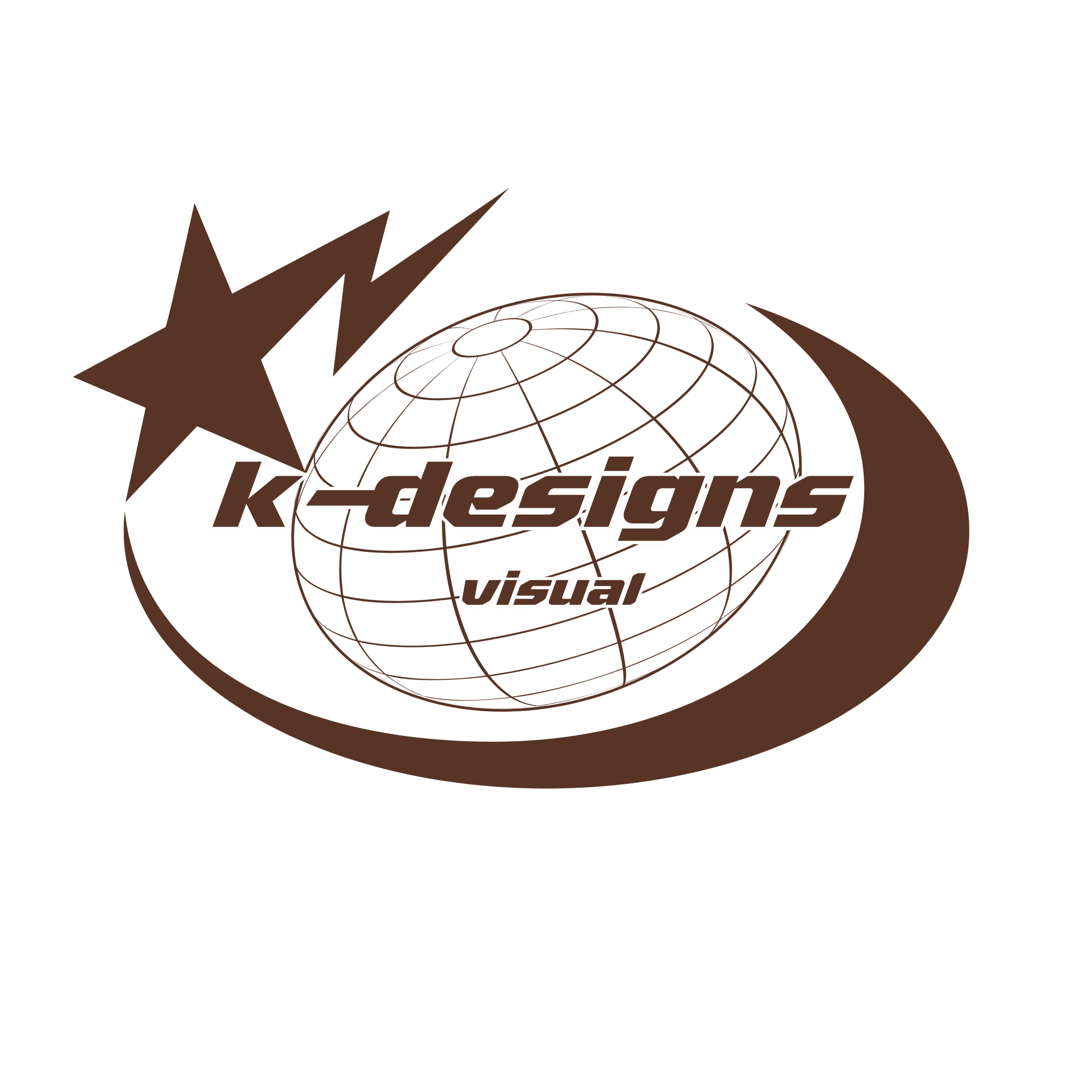


K-Designs Visual
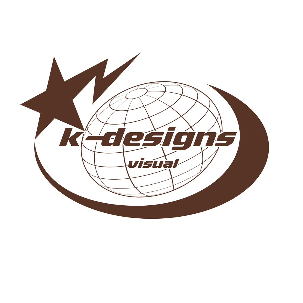
This is the logo system for my own design practice, K-Designs Visual. I wanted something bold and playful with a retro-modern feel, so the primary logo pairs a slanted, chunky wordmark with a shooting star, a globe, and a sweeping orbit line that gives it a sense of movement. Because a detailed logo doesn’t work everywhere, I also made a simplified wordmark and a compact “k-d” monogram for small spaces like icons and profile pictures. I chose brown because it feels calm and warm but still confident. I started with a hand sketch, built the final versions in Illustrator, and tested layouts in Canva.
What I learned: when I went with what I like and kept it simple, the design came together quickly.
“k-d monogram in dark brown: a slanted bold lowercase k and d joined by a horizontal dash.”
Leave a Reply